Out of the box, Cinnamon decides to group the taskbar buttons like later Windows did. It’s often a huge annoyance to people who hates context switching in our head (I like huge workspaces that I can see everything at once so I don’t overlook clues from the relationship between things I’m working on. This is how I find difficult twists in research problems that other people give up solving).
In Windows, you right click on the taskbar, get to settings and there’s a pulldown menu for you to decide whether and how the buttons are grouped. Easy. But Cinnamon still have the Linux smell: organize things that are logical to programmers but not users (Tektronix, DD-WRT, etc. does that too), then surprise users with poorly thought out default behavior.
This time it’s a can of worms that requires some web searching to find people with the same exact specific problem (it’s a sign of poor UI design if the users cannot guess from the UI how to do what they want).
- Needing to change whether buttons are grouped is common. It should not take a lot of steps to change the behavior, preferably a right click context menu

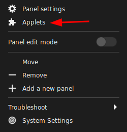
- I would have thought it’s under Panel Settings, but hell no, things has to be organized the way the code was designed (sarcasm). It turns out that the windows button grouping is handled by an Applet called “Grouped Window List”
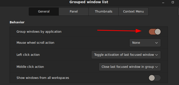
- Some user suggested removing the applet altogether (turns out it’s wrong and unnecessary as turning it off will disable the taskbar altogether and there’s an option to disable it within the applet’s setting: the applet itself is the windows list, not just the grouping feature), but by default the applet was not activated the settings button is dead. I have to go to the bottom navigation bar in the window and hit the ‘+’ sign to get to the settings so now there’s a check mark next to it and the setting (gear) button is now activated.
They also did not dim the settings button (two gears) when the ‘grouped window list’ is not activated (bug?), which made me think I can configure an Applet that’s not in use. Not to mention the previous settings got cleared (reset) if I disable the Applet and re-enable immediately afterwards (bug?)!

- Now I can finally get to turn this shit off

- This is where I think the UI design’s really messed up. After you activate/deactivate the “Grouped windows list” applet, the buttons aligned right instead of left (default)! WTF!?! Do not do shit to surprise users! There’s absolutely no freaking logical reason why the taskbar button alignment should change the default (or the current state) for any reason!
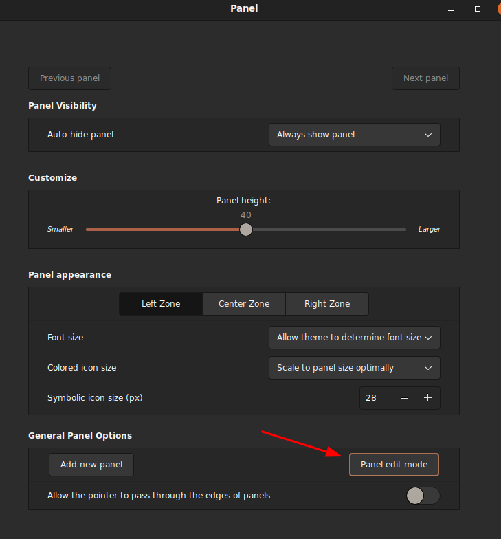
- To fix this, you have to so something similar to unlocking the taskbar in Microsoft Windows to move the task button bar. It’s easy in MS Windows as you just right click context menu on the taskbar to unlock and just drag the starting separator (the || bar on the leftmost where the taskbar starts) to specific position you wanted. In Linux/Cinnamon, you have to enter the ‘Panel Edit Mode’ to unlock the taskbar so you can drag things around:

- I was confused while dragging the task button bar because there’s no clear position markers of where the task button starts and where it can ‘snap to grid’. It’s easy to drop it to the center to align center, but to align left, you have to watch for the buttons you want to insert before to move around to tell if it was a valid place to drop your new taskbar position What a pain in the butt!
This UI design suck, and I can totally understand why they would do something like this because of my programming background. It’s very logical for the programmer to modularize it as one applet, but first of all, generic suffixes like -let and -get does not help users get what the name means: it’s geeks’ way to name abstract concepts without getting the essence of the use case.
In MS Windows, the ‘Applets’ are organized roughly the same as ‘Toolbar’, except Windows is slightly more specialized that they have a ‘Toolbar’, ‘Start Menu’ and ‘Systray’ as distinct concepts instead of abstracting them into a higher level object as in ‘Applets’.
The biggest gripe I have about Cinnamon’s design choices is that detailed position adjustment needs to be easily accessible it’s likely that user preferences may vary a lot.
- By not having a separate Toolbar concept, they forgot to add direct ‘unlock grouped windows list (aka tasklist toolbar in MS Windows)’ option (context menu item). You have to click through ‘Preference > Configure’ to get to get to configure the ‘Grouped window list’
- Since the ‘Grouped window list’ is a (container) ‘bar’ within a bigger’ bar’ (Panel), the position of the window taskbar is logically organized under the platform (the bigger bar, hence the Panel), therefore the unlock window taskbar setting belongs to Panel, not Applet. This makes sense to programmers who knows that the feature is conceptually organized as container objects, but this is hell of confusing for users if they have to reason through this when they are trying to do one of the most common things!
- Unlike MS Windows, you cannot use the task buttons while you are in Panel edit mode. Panel edit mode (you enter a special mode where you drag objects into positions you like, but cannot actually use them, then freeze it after you leave the mode) is the same concept used in Interactive Broker’s Trader Workstation (TWS), which is a pain in the ass but I understand the massive work saved for the people who designs the code/UI. Of course it comes at the expense of user frustration.
- The solution article was written in 2018 and I’m surprised I still need that in 2022!
![]()
That’s not in the least the biggest gripe with Cinnamon. It can easily be solved by starting the Welcome Screen in Preferences and choosing First Steps > Desktop Layout > Traditional. Unless I misunderstood the idea. However, the worst design failure is the lack of multirow ability. Like yourself I like to have things visible at all times, therefore there are a lot of icons in the right “systray” area. Combined with not-even-enough icons in the left “quicklaunch” area there is only so much free space left for the middle “taskbar buttons” area. Fortunately there is an applet that can… Read more »
I am using Ubuntu Cinnamon Remix, which does not have `mintwelcome` (Welcome Screen). Do you know if there are other ways to get to the traditional taskbar/panel? Linux GUI had always screamed ugly to me and kept me crawling back to Windows. A lot of that has to do with the font, buttons and windows spacing as most Linux graphical shells either waste a lot of screen estate on white spaces or they got too crowded. I finally settled on Cinnamon as it’s the least repugnant to me that I’m going to give Linux a try as my primary OS.… Read more »